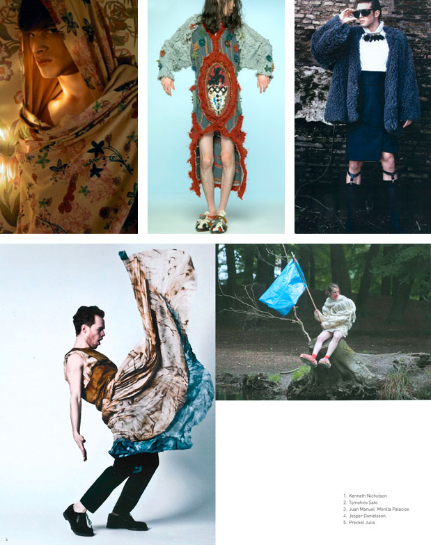
We have been researching creativity for over eleven years now and we always have two objectives on our mind: on the one hand our attention focuses on spotting the new ITS generation, on the other we aim at detecting any signal arriving from the world of creativity. We do our best to read between the lines and like gold miners we look for every single speck of gold. The result we wish to achieve is a snap-shot free from the structures of conventional thinking, able to capture universal and transversal feelings tracing, if possible and if present, a common will and desire. A connecting thread that goes from Argentina to Zimbabwe passing through Australia, Belarus, China and joining Indonesia to Alaska, Japan to Iceland, South Africa to Malaysia. Thus different cultural realities that convey and rework the same message by giving their own personal interpretation are mixed together, without necessarily losing their identity. In a globalised world the message is clear: the same interrogatives seem to be puzzling creatives all over the world. Each one of them gives their own personal answer. Sometimes the reactions from people both physically and culturally far apart can be shockingly close.
What follows is not intended to be an exhaustive analysis of the trends we have observed. We do not want to appear neither dogmatic nor conceited since neither feature belongs to us. We definitely write down more than what we analyse in detail and it is always our own personal point of view, partial by definition and perhaps even naive. But it surely is a point of view based on a twenty-year experience, always willing to listen to other opinions. Furthermore we would like to underline that the images we used were not chosen on the basis of an evaluation of merit, but because they clearly visualise the trends we have detected. Many other collections referred to the same trends, though not presenting images that could be used in this report.
COLOURS
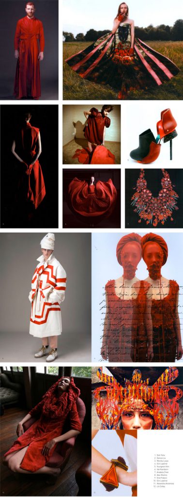
RED
With an etymology that goes back to the sanskrit “rudhira” for “blood”, red is the most visible colour in our spectrum and has been used by man for millennia. Together with black, it was the first colour used by prehistoric man in primordial art since it was easily obtained in nature from rocks, soil, plants and from crushing specific berries. It carries along a huge variety of symbolisms: energy (it obviously refers to the sun), extraversion and will, strong passionate nature and belief in one’s self. Love, sexuality and sensuality but also anger, embarrassment and danger. We have seen it used transversally without distinction in fashion, accessories and jewelry collections, often as the only colour.
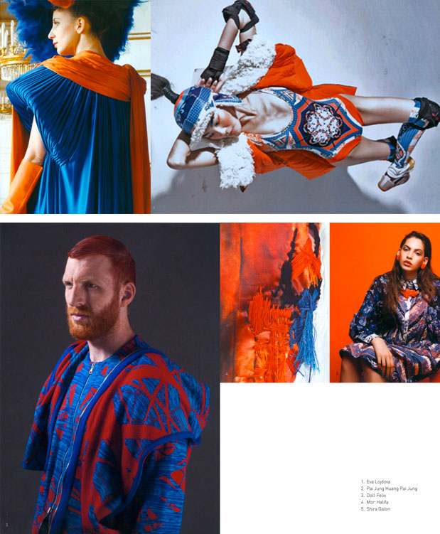
BLUE
Equally noticeable is blue. It crosses human history much later as a dyeing for fabric. The first blue pigments were made using minerals like lapis lazuli. Import of this mineral was very expensive (most of lapis lazuli, for over 3,000 years, came from mines in Afghanistan) and therefore its use was exclusive to the rich and powerful. Blue was considered a protective colour for the dead in ancient Egypt. It was used as the colour for the objects that the dead would carry in the afterlife as well as to dye the mummification gauzes. In the 15th century blue experiences an explosion both as the colour of the working class outfit and for the nobles’ and emperors’ clothes. That was because indigo was imported from India, produced at a cheap price from a widespread bush in Asia. The armed forces (think of “navy blue”), working class, rulers… blue turns into a democratic colour. The strongest among “cold” colours it is a symbol of harmony, stability and balance.

RED AND BLUE
We have often seen blue combined with red and no other interfering colour. We can certainly say there is a strong juxtaposition of the two.
BLACK WHITE GREY
Just as last year, we observed black and white which have not disappeared and are still among the designers’ preferences. It looks as if black against white, just as red and blue together, highlight an underlying trend we spotted in a great number of projects: the juxtaposition of extremes. We end our survey with a note on grey, spotted several times in the contestants’ projects. Historically it would recall the colour of untreated wool and for this reason it often symbolised the clothes of poor people or of friars (Franciscan friars in England were called “grey friars”). Neither cold nor warm, neither material nor spiritual, it is a colour without personality and thus adapts itself to any other colour. Since the Industrial Revolution it is also the colour of progress (not necessarily positive), of concrete in modern cities, of smoke from factory pipes. The absolute modern colour.

PRINTS
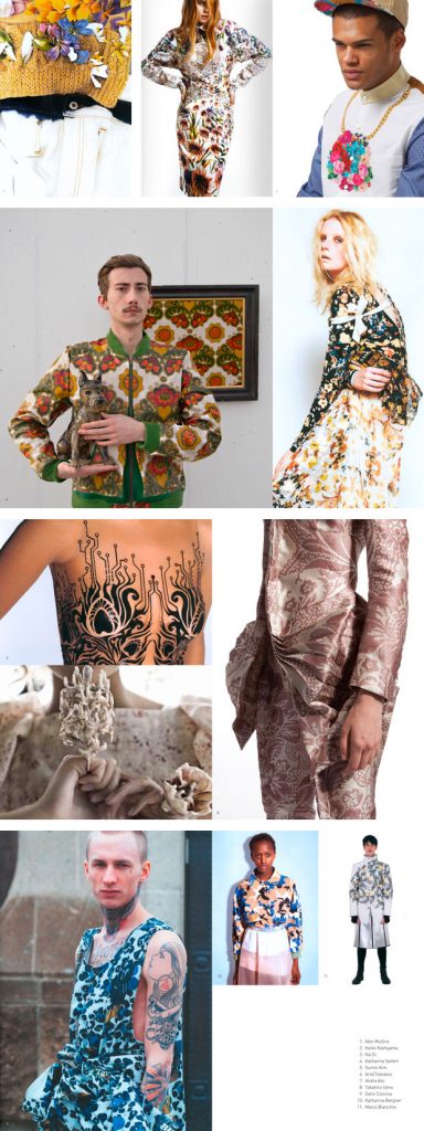
FLORAL AND MIMETIC
If we draw our attention to prints, we often noticed two main trends applied using the colours described above. The floral element first of all. Flowers and plants were largely featured both in contestants’ prints and inspiration moodboards. The reference to nature is obvious but is there again some kind of contrast to point out? Because once again it appeared to us that floral prints were used to recall a past age (the imperial courts’ brocades, romantic chivalry, biology catalogues from the 19th century) juxtaposed to modern shapes, as if to underline a duality among classicism and modernity. The other trend we noted in prints was the use of camo patterns. These were never abandoned by young designers though certainly stronger this year. It is an alternative camo pattern, not based on the classical green tones but happily influenced by this year’s colour palette.
CONCEPTS
DUALITY
We shall start with the concept of duality, of the juxtaposition of extremes, of contrast. We only hinted at this in the previous paragraphs but it was probably the most widespread theme. We saw it in a great number of inspiration images as well as in the collection shoots. Man against woman, red against blue, classic against modern. Sacred and profane, deconstruction and reconstruction, simplicity and complexity. It also must be pointed out that aesthetically (we are thinking of the photoshoots we saw in the portfolios) contrasts are capable of producing very powerful images.
CONSTRICTION AND COVERED FACES
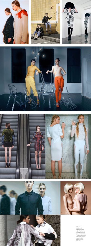
Two strong and returning themes (we had already encountered them in the past during particular historical moments of war and instability) are constrictions and covered faces. Bondage techniques but also stylised fabric cages that block movements. Masks to transform faces and often to hide them entirely as if to underline the need to avoid seeing or be seen. Are we again facing an age in which young people do not want to choose among equally appealing extremes? Or is it again the fear of the future, of not wanting to think/see what will come, of being unable to move/decide?

RELIGIOUS ELEMENTS
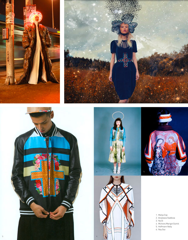
An interesting trend we noted was that religious elements were still featured this year. Last year they focused on the reinterpretation of nuns’ and Muslim women’s garments. This time we saw prints of images from the Christian tradition used both as the symbol for supernatural protection and to highlight the clash between sacred and profane, classic and modern. Not shapes therefore but an actual iconography.
SHAPES
PROTECTION AND MEDIEVAL
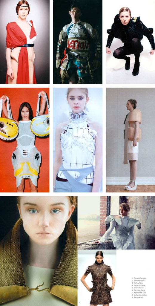
The need for protection appears to have influenced the shapes of the fashion contestants’ collections. Techno-sporty pads on the hips, modern armours inspired by Eastern and Western tradition. Wooden structures protecting the shoulders, tops that remind of iron-plated shirts of knights and samurais. A medieval influence on shapes also seems to be closely connected to the theme of protection. We have noticed typical armour shapes creating protective superstructures over the clothes as well as hoods and shawls reminding us of the same historical period. Moreover, medieval was also often juxtaposed to modernity, once again highlighting duality.
POST-MAN
For quite some time we have been observing another phenomenon in constant evolution, gradually outlining a new kind of man, an androgyny which we could define as post-man. It’s a man that has taken a step forward in the direction of a sexual (and genetic, too) unification. This is not about feminizing man, this is more about an actual third sex that questions clothing standards as we know them. It starts from a simplified basic male body and opens up a new gender.
